


Food Pond
Role: Designer, Researcher, Prototyping, Testing
Date: Feb - April 2023
Food Pond is an organization that provides relief to those experiencing food insecurity. We want to provide a way for users to deliver fresh food directly to those who need it, as well as allowing those in need to find ways to access fresh food and additional assistance. Food Pond’s primary target users are families, students, and working adults that want to give back to their community and minimize food waste.
The Product
Many food drives are nonperishable, processed food based. This can negatively impact health, energy levels, and overall quality of life.
The Problem
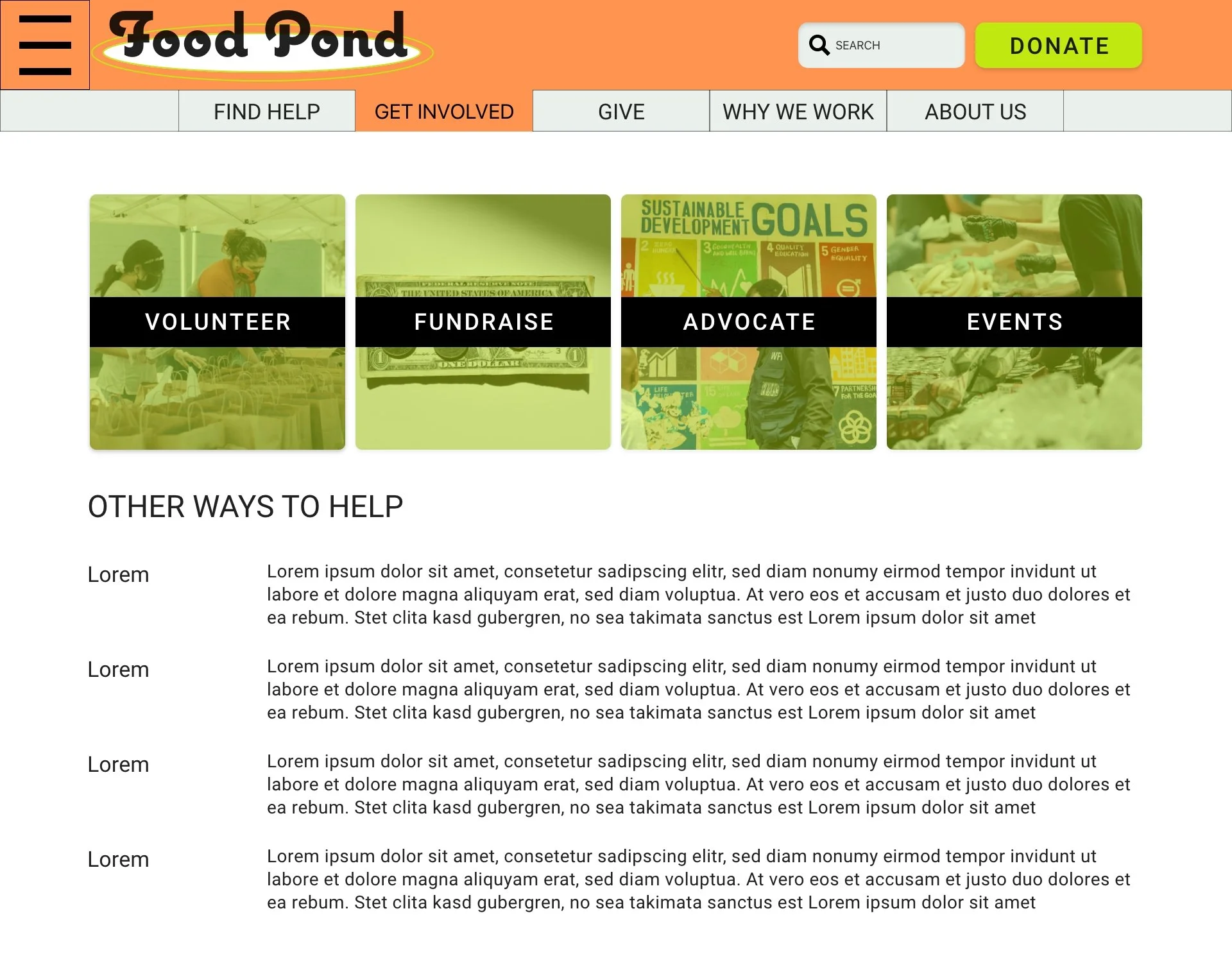
Design an app to locate access points for those to deliver fresh healthy food to those experiencing food insecurity.
The Goal
Conducting interviews, research, wire framing, prototyping, conducting usability studies, accounting for accessibility, determining information architecture, iterating on designs, and responsive design.
Responsibilities


Competitive Audit
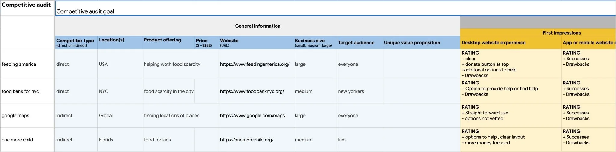
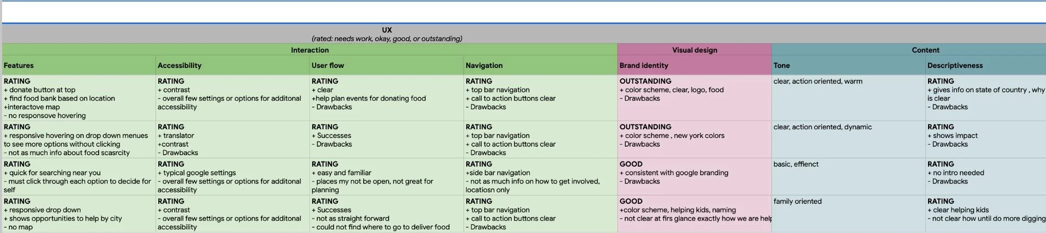
An audit of a few competitor’s products gave insight on unfulfilled needs and opportunities that Food Pond could address with their app.
Ideation
Conducted a series of crazy 8 exercises to develop ideas for how to address the gaps from the competitive audit. Focusing on locating donation sites and arranging drop off.
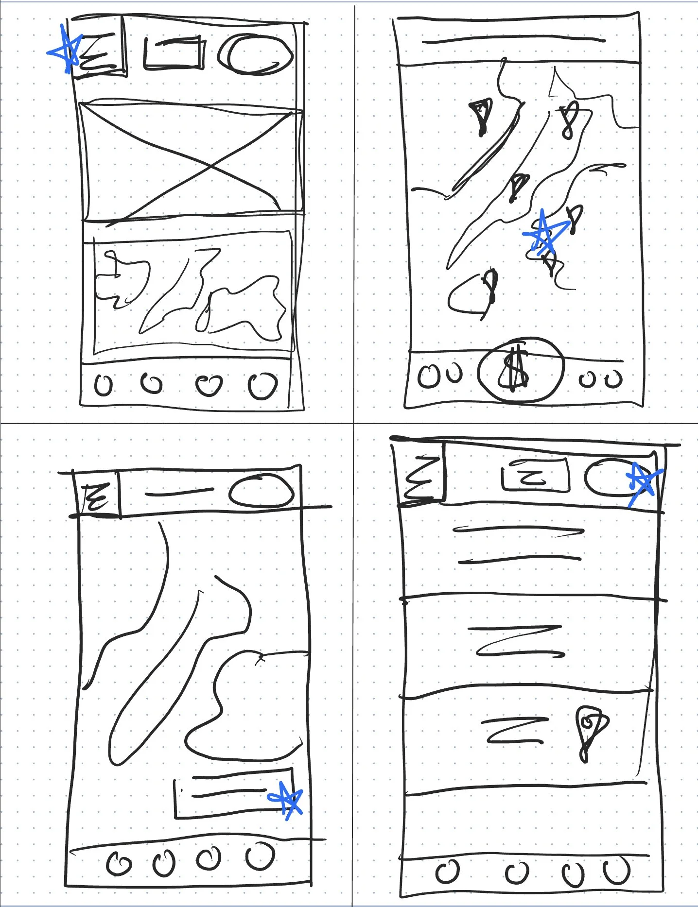
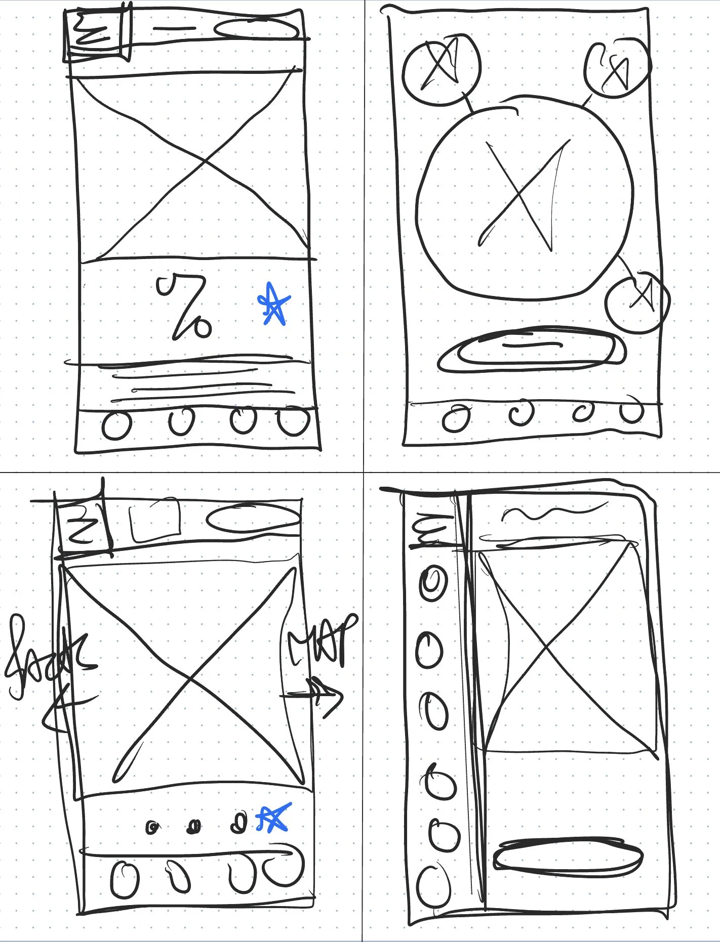
Wireframes and Prototyping


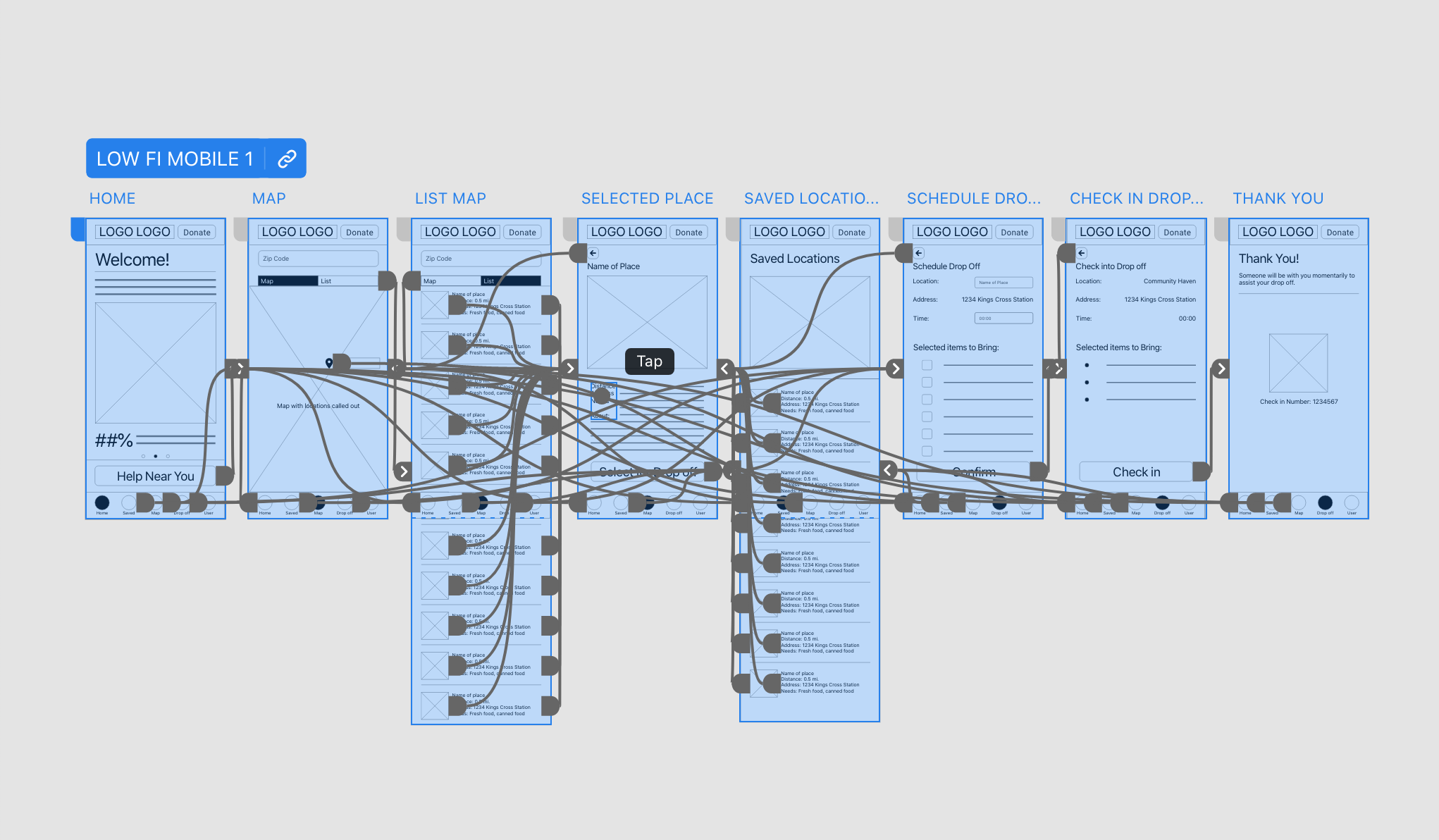
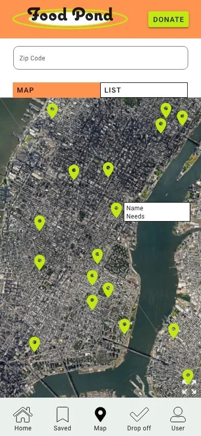
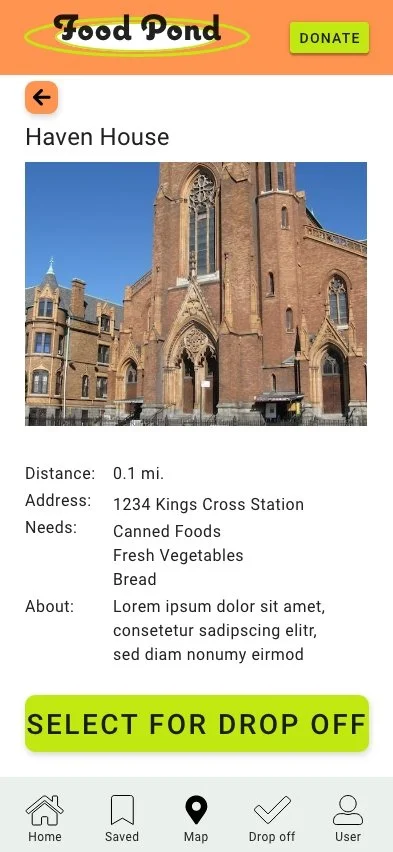
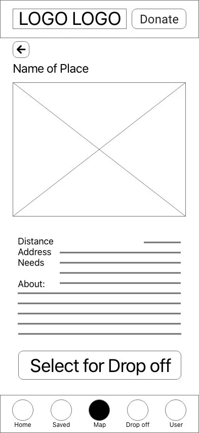
This low fidelity prototype for usability testing connected the user flow of locating a donation site to delivering food to the site.
Usability Study

The flow was very straightforward and simple to navigate through.
Users was easy time change selections.
The navigation bar is a secondary tool.
Usability Study Findings
Refining the Design
Before Usability Study


After Usability Study
Additional changes were made to the the scheduling drop off sequence. The users are given a more intuitive means of selecting a time to drop off their food as well as let the location know what they are bringing.
Additional images and color selection was added to make the call to action buttons stand out to users. The text was organized in a way that is easier for users to read and understand the information quickly.
Sitemap and Accessibility

Site mapping
A way to organize the information architecture and ensure a cohesive experience when creating responsive designs
Accessibility considerations
Hierarchy of text is used to easily locate important elements of the design.
Color contrasts have passed recommended a11y ratios.
Initial focus of home screen help orient user and define the main user task.
Responsive Design

The designs for screen size variation include mobile, tablet, and desktop. Designs were optimized to fit specific user needs of each device and screen size.
App fuction to return easily to saved drop off or pick up locations

Tablet view of what it would be like if the use chose to make a monetary donation to the organization instead of food.
Web fuction to learn more about the organization and how to get involved. Desktop webpage provides more expansive information in addition to the main function of food pick up and drop off.